Toning The Ground Creating work that glows from within
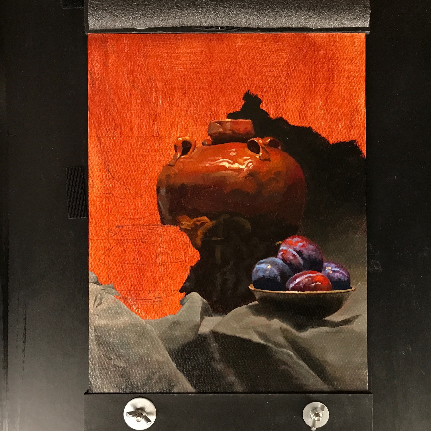
The idea that artists begin their work on a pure, white surface is so common that it’s worked it’s way into our language – we speak of a “blank canvas” as a pristine starting point on which we can develop our fresh thoughts and ideas.
And indeed, many artists do like to being their paintings this way – putting their paint directly on the gleaming white surface (the primer covering the canvas or panel – technically known as the “ground” or sometimes the “gesso” – is invariably a brilliant white).
Both of the artists I trained with recommended this approach, and of course I’ve begun many paintings this way.
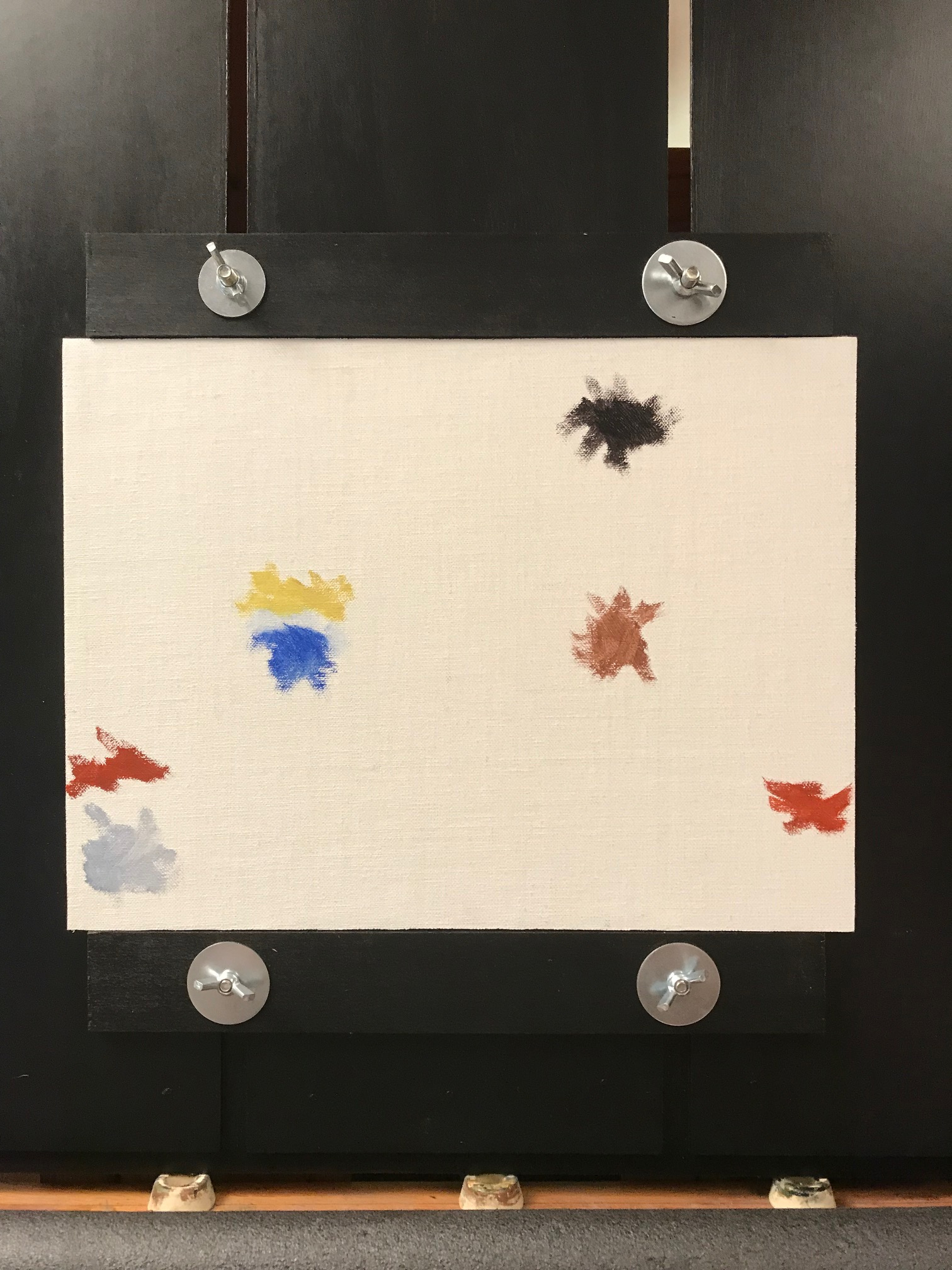
There is a simplicity and purity to working like this – you can just start painting right away.
But it does create some challenges from beginning to end.
The glistening white of a pure canvas basically produces glare, making it quite difficult to see correctly, especially in the beginning – it can feel a little like pointing a bright flashlight directly into my eyes and still trying to see what I’m doing.
This makes it hard to judge relationships between the bright colors (like the highlights) since the canvas is already at maximum brightness – there is no place “up” to go.
Also, any place where the paint does not fully and opaquely cover the canvas will show through with lighter areas or even white dots and spots – a look that I find quite unappealing.
Some artists go to the other extreme, and begin their work on a pure black surface.
This fixes the problem of the glare, and I would prefer to see black spots show through where the paint is thin instead of white spots.
But it creates something of the opposite problem, as now becomes more difficult to judge colors in the lower end of the range – there isn’t anyplace darker to go than what is already there.
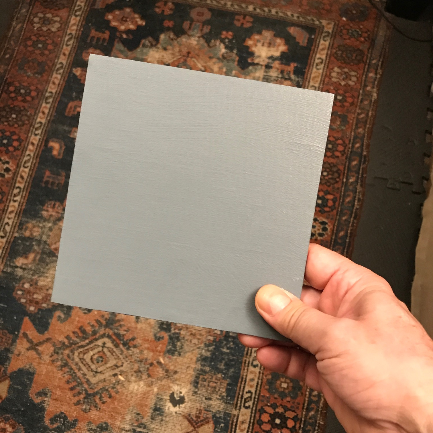
The solution is to paint on a surface somewhere between white and black.
One way of doing this is simply by adding some black to the primer which coats the surface, resulting in an even, mid-range gray.
This is what I do for nearly all of my smaller paintings.
It’s a fine surface to work on, plenty of room to go up into the lights and down into the darks while still accurately judging the relationships.
The caveat is that a gray starting point makes it very easy to begin with colors that are not particularly intense, leading in the end to a drab color harmony – this is overcome by awareness, care, and constant attention.
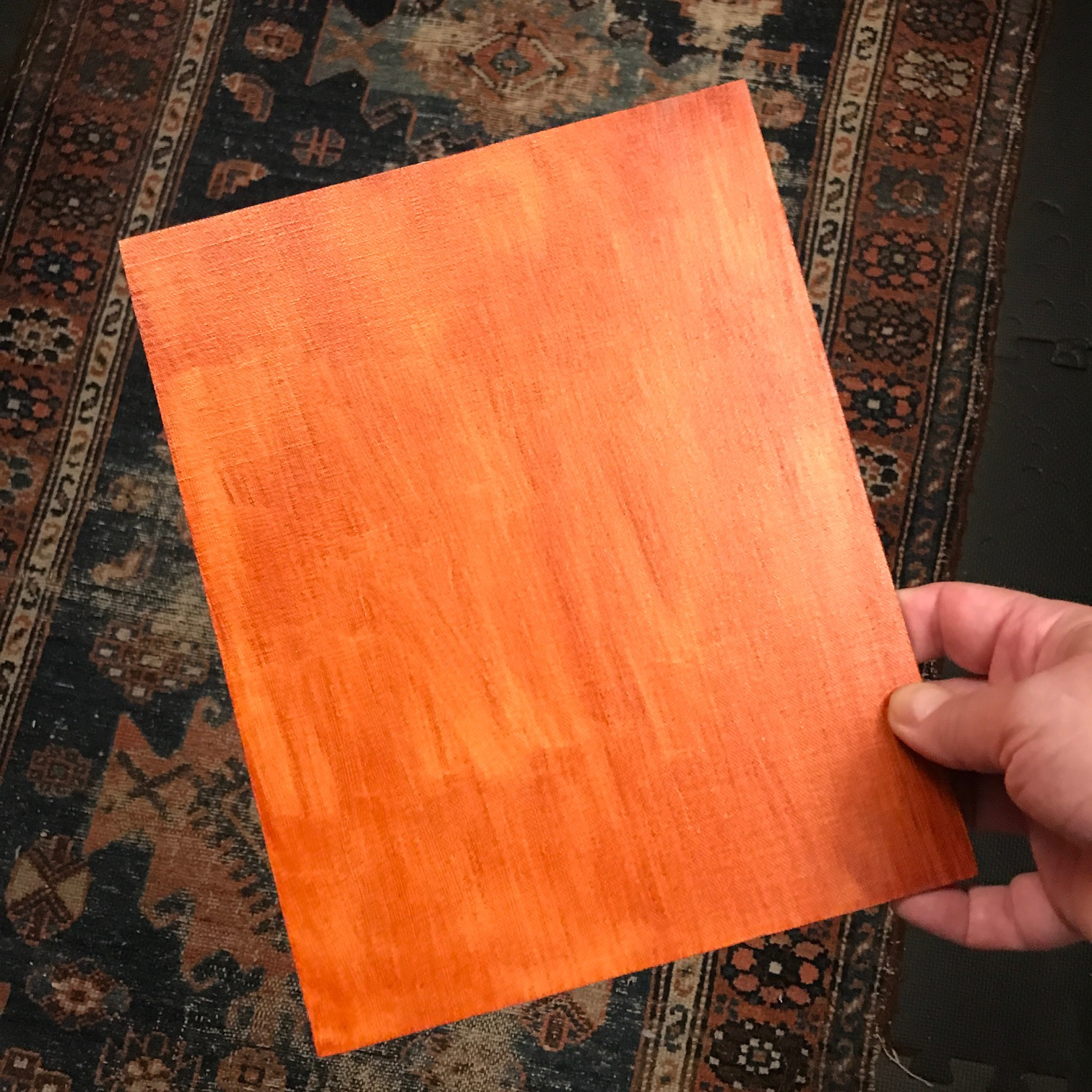
Another – easier – way to modify the pure white canvas is to apply a thin, even layer of color over the entire surface – known as “toning” the canvas.
This is what I do for my larger paintings, and it’s been my experience that a canvas toned with color more easily leads to richer and deeper colors in the final painting.
I’ve experimented with a wide range of colors for toning the canvas – with sometimes surprising results (blue and green toned canvases are real delights).
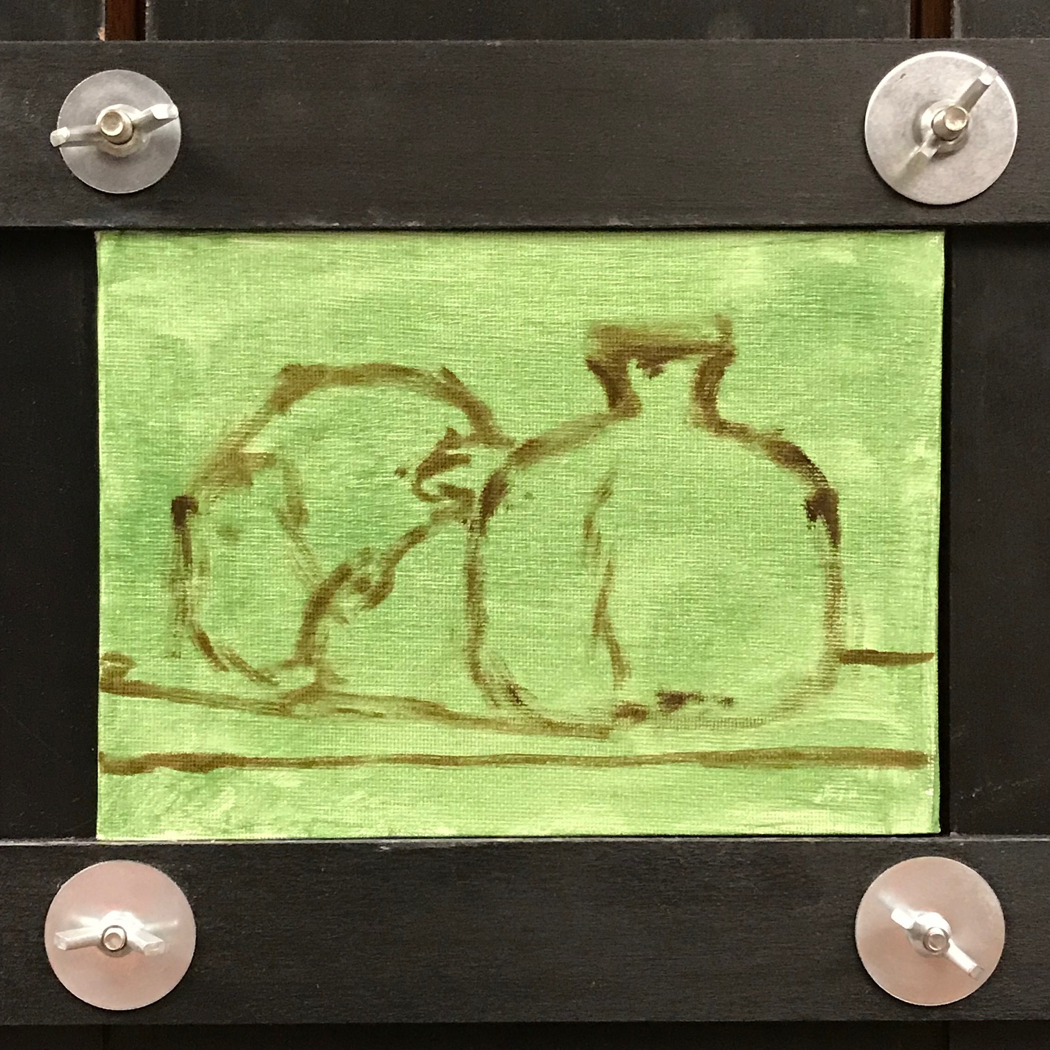
But like most artists, most of the time I use simple earth tones – my preference is Transparent Oxide Red – similar to Burnt Sienna but a more saturated red, and as the name implies, quite transparent.
This gives the canvas a rich, glowing surface – actually quite similar to copper.
As with the gray surface, there is plenty of room to go up into the lights and down into the darks without losing the ability to judge the relationships.
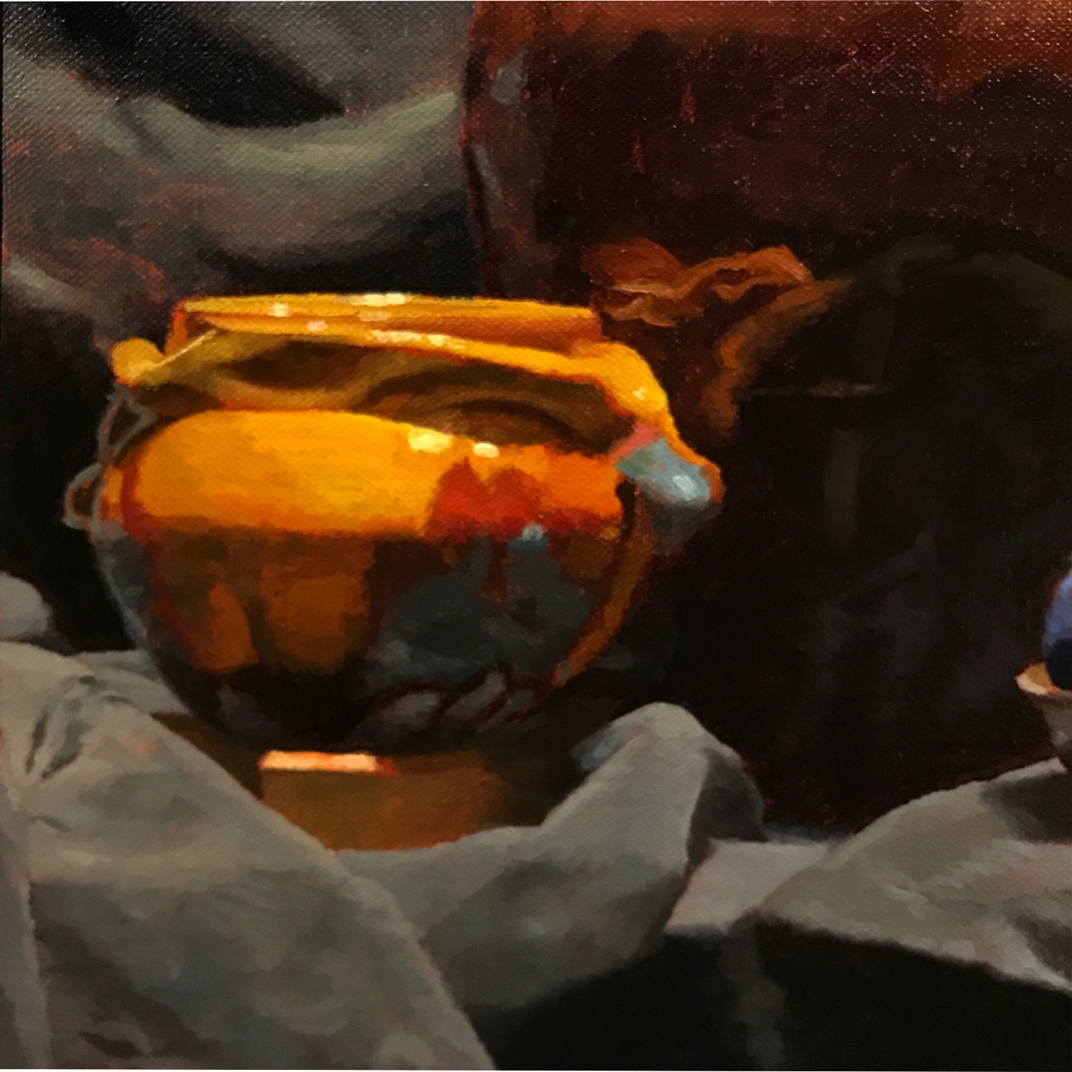
But where the final paint is thinly applied, some of the warm copper-like tone will shine through, making the painting appear to glow with an inner fire – a truly noble and majestic effect.
For me, this is the real value in toning a canvas.
Often, of course, the paint is applied so thickly that the ground will never be visible. But, next time you’re at the museum, take a close look at some of your favorite paintings – you might just be able to glimpse the foundation that the artist built their work on.