How did you do that?
From time to time I’ll get a nice compliment about how I paint metal. This is often followed up with questions about how I do it.
Unfortunately, there’s not a simple secret that I can reveal. I approach metal the same way I approach any other type of object: Observe patiently, mix colors carefully, work with large shapes first and then details, and always, always, always think about the texture.
Those are the deceptively simple rules for painting anything well in this style. They apply to people, trees, oranges… and of course metal.
Think about mirrors
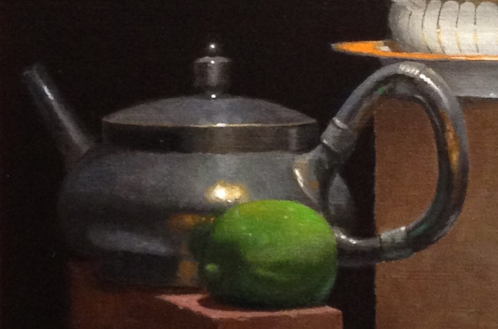
There is one concrete piece of advice I can offer about painting metallic objects, though: Think of them as a low grade mirrors, and pay very close attentions to the highlights and reflections.
Highlights on metal often contain very specific information about the light source, since they’re nothing more than reflections of that light source. By carefully replicating the shape, color, and intensity of the highlight, the artist will go a long way to replicating the texture of metal. One thing to be aware of is that strong highlights on metal can act as prisms, and split the light into subtle colors around the edge of the highlight.
And like any other mirror, metal objects will contain reflections of the objects around them. Since the surface of this mirror is generally not flat, those reflections will be distorted to varying degrees. Unless the metal is highly polished, the reflections will generally be somewhat darker and less chromatic than the objects themselves. As an example, look at the dark, muted reflection of the lime in the above image.
By paying careful attention to highlights and reflections, anybody with rudimentary painting skills can effectively reproduce the look and feel of metal.
John Morra
January 30, 2018 @ 8:29 am
Hey Jeffrey!
One of my favorite moves is to use glazes when painting metal. I usually paint everything a step above in value, and then glaze down with something (Ivory black, Lamp black, ultramarine plus burnt umber, or whatever looks best) , and then I paint up to the right value again. For some reason, the glaze gives the metal a characteristic “epidermal” layer that is so often present in metal things. The same phenomenon exists in fruit too — which is why semi-transparent paint on top of a brighter underpainting makes an apple seem more, well, apple -y.
Also, the reflections in the metal from the surrounding objects take on a different kind of reality than the actual objects when you have a glaze on top. I do the same when painting jars of preserved fruit — having the glaze makes the “inside the jar event” different from the stuff outside the jar.
As for treating the metal as a mirror, I think of EVERYTHING as a mirror, as chrome-plated– but some of this chrome has a tint to it, and some is a lot shinier than other chromes. So this means the so-called “core shadow” on a lemon is really the reflection of the dark studio ( I got this idea from Delacroix”s journal — it’s not my idea).
Jeffrey Hayes
January 30, 2018 @ 2:05 pm
Thanks John!
Sounds like a really intriguing technique, and I’ll certainly try it first chance I get. I’ve worked with darkening glazes before, but only to get some subtle transitions I wanted (it can be really lovely), not for textural effects. Do I assume you’re painting in full color first, glazing down, and then essentially scumbling up to the desired value in parts?
That idea of shadows as reflections is kind of a kicker – I’ll be sitting with that thought, too.